
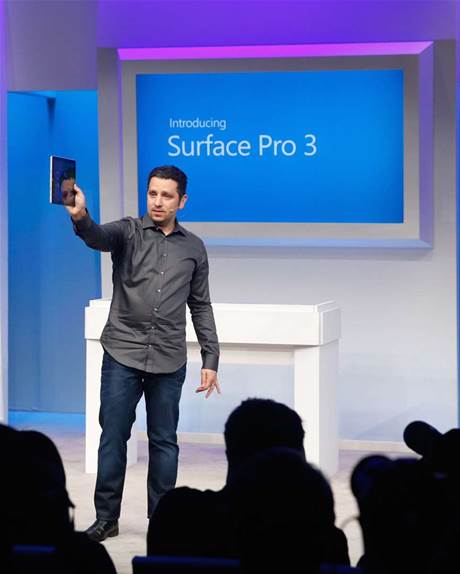
I’m not a baller, so there’s going to be a bit of “who does this guy think he is?” and I acknowledge that. Nevertheless I’ve always been pretty good at presentations and have a view on how Panos Panay, chief of Surface for Microsoft, could have done better in his Surface Pro 3 unveiling. So I’m going to share that view.
If you look at people’s comments on tech websites and forums, quite a few thought Panos did a great job. And he did do a good job. He did a lot of things right, chiefly:
- Positioning the Surface as a tablet that can replace the laptop — there’s finally a sentence people can point to and say, that’s what the Surface is
- Identifying the MacBook Air as the most direct competition
- Comparing the Surface size and screen ratio to a legal notepad
- Demoing with the new Photoshop, crossword puzzle and movie scripting
- Emphasizing pride and passion in the work they’ve done
But he could have done a lot better. 2000 words’ worth of suggestions better.
Note: I’m going to refer to the Surface Pro 3 as just the Surface for this post. Less to type.
If you haven’t already seen it, here’s the keynote:
Let’s start with the venue. The environment didn’t play to Microsoft’s strengths. It was a room with lots of chairs and no tables, forcing journalists to balance their MacBook Airs on their laps. Almost as if Panos is inviting the audience to compare that experience with the Surface on their laps.

You don’t fight your greatest competitor with your biggest weakness, and “lapability” is most definitely the Surface’s biggest weakness despite recent improvements. Microsoft should have had tables to subtly remind journalists that most people work on flat surfaces, which the Surface is perfectly fine on.
I thought the tone was all wrong. Microsoft is too used to being the lead dog, but when it comes to computer hardware they are the underdog. I would have played to that instead of talking like they’ve already succeeded. When Panos talked about the dilemma consumers get in choosing between tablets and laptops, he confidently declared that
Today we take the conflict away. I am absolutely sure of that.
Later, Panos even tells Microsoft CEO, Nadella:
I am sure Satya, I am sure. That this is the tablet that can replace the laptop. I am sure.
He says “I am sure” to Nadella no less than three times. This bravado rings hollow; it sounds insecure. A humble, authentic tone would have worked better. Microsoft, you’re the underdog, not the lead dog.
Panos shouldn’t assert the Surface will FOR SURE replace the laptop. Because for some people – especially the audience in the room – it won’t. Most journalists won’t purchase a Surface instead of a MacBook Air. The MacBook Air simply performs better for what they need: longer battery life, lapability and a better keyboard. Journalists are constantly writing; they write everywhere, cross-legged, on the couch, lying down; they are away from a power plug more often than most. It’s a specialized group with specialized needs.
That is why the declarative tone is the wrong tone; you don’t assert to an audience who aren’t likely to agree with you on a personal level. Instead, you have to present an alternative perspective; you have to invite them to empathize with your real target market.
Yeah, I know Panos played a touching video. But it needs to go further; the fact that the Surface is solving real problems for real people should be woven into every aspect of the presentation. It’s actually a great talking point, because the people who love the Surface tend to be people with cool jobs: mobile professionals, doctors, artists, industrial engineers. College students even, as long as they aren’t dancing.

Panos needs to frame the Surface for those people, not journalists. Talk about how the Surface can make a big difference to them. Journalists will get it. So when they write their reviews, they’re not thinking, “The MacBook Air is just better than the Surface for the things I care about.” They’ll be thinking, “This Surface thing is going to make a big impact on some people.”
Instead, Panos kept telling reporters that the Surface can replace their laptop. He challenged on a personal level even. He placed Joanna Stern, the WSJ tech columnist, on a pedestal and told her they’ve created the device of her dreams, the device from the future. He’s “pretty sure it meets her needs.”

By declaring that it’s “so critical, so super important” for the Surface to work great on the lap in order to replace the laptop, Panos set the Surface up for failure. The form factor will never feel as good on the lap as a MacBook Air does. So when a journalist tries the Surface on her lap and inevitably doesn’t find it as comfortable, she concludes the Surface is not a good laptop replacement. Oops. Panos effectively asked journalists to judge the device on its weakest aspect — that’s not very smart.
Panos shouldn’t have talked about lapability at all. Focusing on it is like putting blood in the water – it tells the sharks where to look — and so naturally reporters made it a major part of their write-ups. It need not be this way.
Don’t tell, show. Talk about the improved kickstand and the extra magnet on the keyboard; then kick back on a couch and prop the Surface on the lap while talking about something else. Draw people’s attention away, but show how the Surface is sufficiently usable on the lap. People will get it but not consciously think about it; and that’s what you want.
The truth is that the Surface just needs to work well enough for the average person on the lap. It doesn’t need to be awesome in that aspect, because it more than makes up for it in others.
I would talk up the size of the Surface. Humbly admit that it’s not meant to replace 7-inch, 8-inch “mini” tablets used primarily with one hand; it’s meant to replace large tablets used primarily with two. And look at this gorgeous screen. See how much more content you can see on a 12-inch, 3:2 screen? How much better is web browsing! Show a website on an iPad mini; then show the same website on the Surface. It’s no contest – a bigger screen is so much better for browsing.

Calculate with the audience the 6% figure cited; this 12-inch, 3:2 screen is the equivalent of a normal 13-inch. Emphasize the Surface’s strengths, don’t defend its weaknesses. Panos did way, way too much of the latter.
Panos also wasted a great opportunity in demonstrating the Surface’s note taking abilities. He took out the pen and…what did he do? He traced, colored and doodled on the Surface, showing how an $800 device solves a problem none of us have. Doodling.

What he should have done is write mathematical formulas, supply-demand curves, flow diagrams. Things that are very difficult to do with a keyboard, but a breeze with a pen. Show how text is searchable. Remind journalists (without actually saying it) that while they may not appreciate pen input because they don’t need it for their jobs, lots of other people do.

What is also amazing about the Surface is its thinness. To demonstrate its thin profile, Panos proudly held it out for journalists to see. Big mistake. From a distance, they can’t see anything. They won’t be able to judge how thin it truly is.
Panos should have contrasted the Surface with something we all already know to be exceptionally thin. The latest iPhone, for example, projected on the big screen for everyone to see.

Bam! That visual gets the message across so much more powerfully than stage posturing.
Know what else sucked visually? The start screen on Panos’ Surface, which he blew up on the big screen. Why is it so freaking ugly?

Check out mine:

It looks so much more dynamic! Everything you show is a chance to demonstrate a strength; Panos’ static start screen was another wasted opportunity.
Another nitpick – Panos has got to stop referring to the Surface as a “product.” It dehumanizes the Surface: it’s cold, it doesn’t have feelings, feel free to bash it in your reviews. No, he should personify it. For example, instead of “We took that product and pushed it down 9.1 mm,” say “We coaxed it down to 9.1 mm.” Instead of “You have the perfect weight distribution on this product. You’ve seen this before in the product. It comes out in droves in the product.” Try “The Surface just feels so balanced. It has perfect weight distribution. Like a ballet dancer. Or a BMW with 50:50 weight distribution.”
Panos positioned the MacBook Air as the Surface’s most direct competition. That was a smart move. Smart because both compete in the market for sexy, thin-and-light PCs; it positions Surface on the high end; and this way it doesn’t seem like Microsoft is competing with their OEM partners. But then why-oh-why is the Surface compared to the MacBook Pro on the official website?
The MacBook Pro is a bad comparison because they don’t compete for the same dollars. Surface = thin and light; MacBook Pro = power.

Update: They’ve switched the comparison from a MacBook Pro to an Air. Good!
Finally, Panos has a tendency to ramble in an almost stream-of-consciousness kind of way. Here’s an example:
If the design point is something as simple as “we believe what can be digital will be digital”, you have to start removing barriers of technology very quickly. A piece of paper and a pen is as analogue as it gets. It is as natural as it gets. The design points through the device shine through. When you lay it down it feels like a piece of paper; you can write on it at any given time. You can move it and use it to replace your 13″ laptops very quickly, yet then you can obviously use it as a tablet any time. But ultimately, removing that barrier of technology is critical to make it feel great. Critical. But how?
You sort of get his meaning — probably more from context than actual words — but he came across as confusing and all over the place. He was trying to say too much when he should have kept it simple. Steve Jobs wasn’t a great presenter just because he had style and charisma; it was because he knew exactly what he wanted to say and went no further. Panos almost seemed like he was trying to fill the air with verbal diarrhea.
He just needs more experience and practice.
Wow, this is getting long — possibly the Cornerplay’s longest post. I should probably wrap this up.
TL;DR:
- The venue wasn’t optimized for the Surface
- Panos’ tone should have been empathetic instead of declarative
- Surface’s value should be framed in terms of its target market, not journalists
- Don’t talk about lapability; subtly showing it is enough
- Panos spent too much time defending Surface’s weaknesses vs. demonstrating its strengths
- There were missed opportunities in showing off the Surface’s pen input, thinness and the beauty of the Windows 8 start screen
- He kept calling the Surface a “product” — that makes Surface sound soulless, lifeless, inorganic instead of beautiful or aspirational
- Panos has a tendency to ramble, which can come across as incoherent

Great piece, I agree with everything you said here. I just discovered your site today and I’m already loving it. Keep up the good work!
LikeLiked by 1 person
Thanks John! The blog is only a few weeks old, so it’s great to know it’s of interest to people. 🙂
LikeLike
Well done… Good points. I’m adding your blog to my Favorites in notime 🙂
LikeLiked by 1 person
This was awesome and I couldn’t agree more. I think the reason this happened comes down to management at Microsoft and their corporatist ways. I would compare it to how touch gestures on Windows 8 cannot be mimicked on the trackpad, something that makes no sense but would happen when designs and plans are drawn in a meeting room between executives instead of creative people.
LikeLiked by 1 person
Thanks for the kind words! I completely agree with you. It’s a travesty that the trackpad isn’t any better.
LikeLike
I have some points to consider:
I totally agree that he put too much pressure on the lapability part, especially concerning that a dedicated laptop will ALWAYS be better on the lap. That brings the words you mentioned “kick back on a couch and prop the Surface on the lap while talking about something else”. What something else? The Surface has nothing else in that part. Nothing else in the presentation fits that scene. Remember, lapability is not only using the Surface on the lap, instead its about using the Surface as a laptop on the lap, to show the added magnet.
One very important thing that they could’ve mentioned is that the Surface doesn’t have to stay in that mode for long, as you mentioned “The truth is that the Surface just needs to work well enough for the average person on the lap. It doesn’t need to be awesome in that aspect, because it more than makes up for it in others.”. Its tablet-first after all. Flip the keyboard back and forget its there. Its not a Yoga. But I don’t know, like if they said the Surface is tablet-first, the perception must be “it sucks as a laptop”.
On the screen part, they want to show that the screen is now comparable to laptops, despite being smaller. Nobody complained about the SP2’s screen as a tablet, but everybody complained about the SP2 as a laptop. That’s what he wanted to point out. Comparing it to the iPad would completely miss the point.
On the pen part, he mentioned it clear “if you are a student, in class, you need to capture that thought” or “a really bad idea that you need to jot down”. Making diagrams is not the point of the OneNote button that he was demonstrating. I agree though, he could’ve drawn something else up there.
On the thinness part, he did show it next to the Surface Pro 2 in the slides, although, a Surface 2 would be a much better comparison, I would say. The reason might be because they’re still selling the Surface 2. They cant compare it to the Airs either. One is obviously too thin, and the other is obviously too thick. And please, do not show any more Apple devices up there.
By the way, good job!
I really enjoy your writings. I actually scrolled from the homepage way down to the 2 pounds tablet post, when you clearly anticipated the SP3!
LikeLiked by 1 person
Thanks for the kind words and feedback!
LikeLike
Hi thankks for posting this
LikeLike