
Yesterday, we reviewed the Moto 360. Please check it out if you haven’t already. Today, we take a closer look at the operating system.
The future of the smartwatch is to be the primary entry point for your digital life. The device you scan first to get an update on what’s happening, and the preferred device for quick interactions like messaging a friend. You’ll want to use your voice; when it works, it’s the most elegant way to control this small interface.
This is the future that Google has presented with Android Wear. It’s an exciting one — even more exciting than Apple’s vision — but realization remains in the horizon. Android Wear may change the future tomorrow, but today it only provides a promise for it.
Android Wear is that pimply teenager. You can see the potential, but the teenager just too annoying to be taken seriously yet.

Android Wear confused me at first, mainly because Google wants you to interact with the watch in a completely different way than we are used to with smartphones and PCs.
Google wants you to use your watch only when you 1) see the time, 2) get a notification, and 3) perform an action.
1) Seeing the time is straightforward.

2) Checking notifications is also straightforward, but only when there are notifications to check. When you get one, a card is displayed against the watch face and it doesn’t go away until you manually dismiss it.

You view other notifications if any by swiping up. However, when you don’t have any notifications, swiping up doesn’t do anything, which was initially confusing to me. My guess is many other first time users will too.
I understand why Google did this. For people who don’t like to think systematically about navigation, the notification is the only trigger they need. If there is no notification, they don’t have to think about it.
However, I personally don’t like this. I’m often too busy to judge a notification — whether it needs action or can be dismissed — but want to see the time. It’s annoying for a card to obscure the watch face, especially when it’s 4 to 8 pm.

I’d prefer if it was more like smartphones: when a notification arrives it’s shown briefly and then fades. You can then review it later whenever you’re ready. Not only is the time checking experience better, it’s also more intuitive for smartphone users.
3) Performing an action, like sending a text message, checking your heartbeat, opening a specific app, etc. are accomplished by voice or list:

The voice part doesn’t work all that well yet, but seems to be organically improving over time.
For example, when I first got the Moto 360, I couldn’t text my girlfriend because Google kept interpreting her name, Devina, as “Davina” which of course doesn’t exist in my address book. But when I tried it today, miraculously, it correctly heard “Devina.” In another example, it used to struggle picking up my voice commands. Now the accuracy rate seems higher.
Is this improvement a result of the software update that rolled out yesterday? This kind of improvement bodes well for the OS.
Voice commands are complex. When I say “OK Google, find me the nearest ATM” it opens results in Search. If I want directions on Maps, I have to say “OK Google, navigate to the nearest ATM.” That kind of specificity can be too demanding.

In some parts of the OS, I can say “OK Google, do X” and it’ll perform the action; in other parts I have to manually exit whatever I was looking at before I can do another voice command. This inconsistency is confusing and a little annoying.
What also doesn’t work well is performing a voice command successfully, and then needing to use a finger tap to confirm the action, like in the example below:
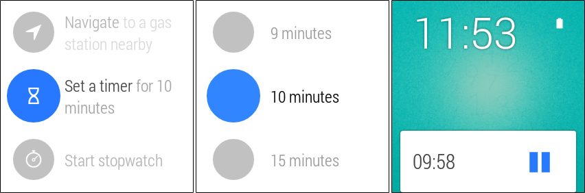
If I’m using voice, I’d like to use voice all the way.
You can tell that Google wants you to use voice to control the device, but you can still use your finger to tap and scroll the list of actions.

A minor point: I wish this list was accessed by swiping instead of tapping; it’s too easy to accidentally trigger with just a tap. I did so many times without knowing, and worse, the watch will start to listen for commands and actually try to execute. This wastes battery needlessly. Of course, for beginners, a tap is easier than a swipe, but once you learn it a swipe is superior.
The software in general still feels basic. For example: I can’t view photos from messages. Another example: I can reply to a Whatsapp message, realize I have more to say but can’t because the reply button is gone. These are annoying limitations.
You expect Google and developers to fill in the gaps over time, but for now, Android Wear has these kinds of limitations everywhere.
In case you find the above confusing, check out this nice overview graphic that Ars Technica put together for navigating Android Wear:

